
Primary logo
Default lockup for light backgrounds, nav, footers, documents, and light hero sections.

Grow organic visibility across search engines and AI discovery platforms.
Drive qualified traffic, leads, and revenue with AI-driven paid media strategies.
Build high‑performing websites and conversion experiences that drive results.
Use AI and automation to streamline marketing workflows, improve consistency, and move faster.

See how your site performs in search and AI visibility.
View Now →Strategic solutions aligned to your business goals and growth objectives.
Talk to a strategist to find the best path for your goals.
Book a Discovery Call →Actionable insights, guides, and tools to help you grow.
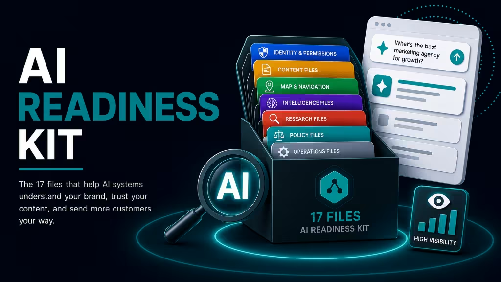
Learn how to increase your brand's visibility in AI search.
Download Kit →Learn about Silverback Marketing and what makes us different.
Let's start a conversation. We're here to help you grow.
Tell us about your goals and we'll build a plan that delivers results.
Get StartedSilverback · Brand standards
Approved logo lockups, typography, CTA patterns, and color pairings for web, decks, and partner materials. Teal accents, neutral foundations, and the category spectrum that powers icons, toolbars, and charts across the site.
Two SVG lockups cover the site: primary for light surfaces and light for dark UI. Always keep the mark and wordmark together.
Default lockup for light backgrounds, nav, footers, documents, and light hero sections.
Use on off-white surfaces and subtle neutral panels where pure white feels too stark.
Reversed lockup for dark teal, carbon dashboards, photography overlays, and the 404 page.
Use on near-black UI shells, dark mobile nav drawers, and high-contrast hero treatments.
Keep clear space on all sides equal to the cap height of the letter S in Silverback. No type, icons, or artwork may enter that zone.
Open or copy the SVG paths below. Right-click any preview and choose Save link as to download.
Three typefaces: Inter Tight for UI and headings, Instrument Serif for italic accent words, JetBrains Mono for labels. All are self-hosted through next/font with `display: swap`.
Primary UI and body
var(--font-inter-tight), ui-sans-serif, system-ui, -apple-system, "Helvetica Neue", Arial, sans-serif
Accent display
"Instrument Serif", "Iowan Old Style", Georgia, serif
Labels and metadata
var(--font-jetbrains-mono), ui-monospace, "SF Mono", Menlo, monospace
Headlines stay in Inter Tight. One or two accent words switch to Instrument Serif italic in Teal. Eyebrows and kickers use JetBrains Mono uppercase labels.
Marketing templates use the same accent pattern inside `.sg-hero` blocks on light and dark surfaces.
| Element | Size | Weight | Tracking | Line height | Notes |
|---|---|---|---|---|---|
h1 | clamp(48px, 6vw, 84px) | 500 | -0.035em | 1.05 | Homepage and marketing heroes; pair with `.accent` or `.serif` span for teal italic emphasis. |
h2 | clamp(36px, 4.2vw, 56px) | 500 | -0.03em | 1.05 | Section heads on light and dark bands; CTA band titles scale to clamp(40px, 5vw, 68px). |
h3 | 22px | 500 | -0.015em | 1.05 | Card titles, sidebar blocks, and subsection labels. |
.lede / .sg-lede | 19–20px | 400 | normal | 1.55 | Hero and section intro copy; use `--muted` on light, `--muted-dark` or #B7BFB7 on dark heroes. |
body | 16px | 400 | normal | 1.5 | Site default; antialiased with optimizeLegibility. |
.eyebrow / .sg-kicker | 11–14px | 400 | 0.16em | normal | Uppercase label with teal dot pseudo-element (`::before`). |
h1Build a smarter growth strategy.
h2What we help teams improve.
h3Technical SEO foundations
.lede / .sg-ledeTeal-first brand accents, neutral charcoal foundations, and a category spectrum that powers service icons.
bodySilverback helps growth teams diagnose constraints, prioritize the next move, and report in language executives trust.
.eyebrow / .sg-kickerSearch & AI Visibility--sans · Inter Tight stack (body default)--serif · Instrument Serif stack (accent spans)--mono · JetBrains Mono stack (labels).serif · italic accent helper classOne eyebrow spec sitewide: a JetBrains Mono uppercase label with a 6px teal dot. The size and tracking never change; only the dot tone and the surface do.
Default on light surfaces: text in Muted #3A3A3A, dot in Teal #1E7682.
On dark surfaces the text switches to Muted Dark #A8A8A8; the dot stays Teal.
Category-scoped content may recolor the dot using the category spectrum. The label text never changes color. Click a card to copy the hex.
The teal family anchors accents, CTAs, and chart highlights. Pacific Blue is the lighter interactive tone; Dark Teal adds depth in data visualization.
Carbon through platinum: the ink and paper system for typography, surfaces, borders, and dark hero dashboards.
Six accent hues differentiate service pillars, hub cards, and capability groups. Each ships with faint and pale tints for borders and fills.
Search & intelligence
AI & content
Paid media
Analytics & reporting
CRM & lifecycle
Web & automation
Category colors appear on capability icon pills, tool-stack signal badges, and service hub accents. Brand logos in the toolbar stay full-color.
Two class families share the same visual language: `.btn` on the homepage, CTA bands, and light sections; `.sg-btn` on dark marketing heroes. Primary fills use Pacific Blue; ghost buttons stay transparent with a border.
Homepage sections, resource strips, and forms on paper.
Marketing heroes, service pages, and pre-footer CTA bands.
Dark `.sg-hero` blocks on services, solutions, resources, and about pages.
Defined in `silverback.css`. Used with `.hero-ctas`, `.cta-band .actions`, and light UI.
Default conversion action
btn btn-primaryPrimary with motion cue
btn btn-primary btn-arrowSecondary action
btn btn-ghostSecondary with forward motion
btn btn-ghost btn-arrowDefined in `silverback.css`. Used inside `.sg-actions` on dark marketing templates.
Default conversion action on dark heroes
sg-btn sg-btn-primarySecondary action on dark heroes
sg-btn sg-btn-ghost| Padding | 14px 22px |
|---|---|
| Border radius | 8px |
| Font size | 15px |
| Font weight | 500 (`.btn`) · 600 (`.sg-btn`) |
| Icon gap | 10px |
| Hover lift | translateY(-1px) |
| Arrow motion | → shifts +3px on hover (`.btn-arrow` only) |
--accent-2 · #2CA0ABPacific Blue — default background for `.btn-primary` and `.sg-btn-primary`
--accent · #1E7682Teal — hover background on primary buttons
--text · #1A1A1ATransparent fill, ink border and label
currentColor · #FFFFFFTransparent fill, white label, rgba(255,255,255,.35) border
<Link className="btn btn-primary btn-arrow" href="..."><Link className="sg-btn sg-btn-primary" href="..."><div className="sg-actions">...</div><div className="cta-band dark"><div className="actions">...</div></div>Supporting tones for warnings, negative trends, and grade indicators outside the primary palette.
Reference tokens defined in silverback.css :root. Prefer variables over hard-coded hex in new components.
| Token | Hex | Role |
|---|---|---|
--dark-teal | #004C54 | Chart muted · depth |
--accent | #1E7682 | Primary accent |
--accent-2 | #2CA0AB | CTA · hero highlights |
--accent-soft | #D9ECEF | Tinted surface |
--chart-muted-text | #9FD4DA | Data viz label |
--ink | #1A1A1A | Primary dark |
--ink-2 | #232323 | Elevated dark |
--ink-3 | #2E2E2E | Inset dark |
--paper-2 | #EEEEEE | Muted surface |
--paper | #FFFFFF | Primary light |
--line | #E2E2E2 | Border |
--text | #1A1A1A | Body copy |
--muted | #3A3A3A | Secondary text |
--muted-2 | #6B6B6B | Tertiary text |
--muted-dark | #A8A8A8 | Dark surface text |
--warn | #B25A1F | Caution |